The Fonture of Futes, according to me – February 2011
This is part of my pages on Typeface or Font Readability, pages where I give some views that relate to the question that this site picks up dozens upon dozens of each day: ‘Which font is the easiest to read?’
Typefaces are like lots of things, they go in fashions, and you can often tell from looking at some text, pretty much when it dates from.

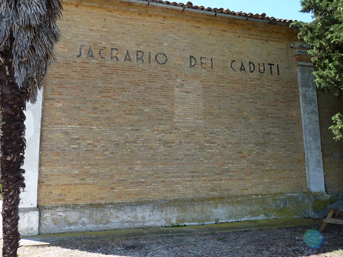
Sacrario dei Caduti translates as Shrine of the Fallen
The example in the photo is from late-1920s or early- to mid-30s Italy, and even if it isn’t, for I do not know exactly its provenance, it still is.
And the Swiss- or Helvetica-style fonts, of which Microsoft’s Arial is one, already look soooo 1980s and 1990s.
So what is the font of the future to be? Incidentally you can read the words ‘Sacrario dei Caduti’ in the photo wihout any trouble can’t you? Despite their very stylised letterforms? For readability, that font is fine then. What is to be the fashion of the future?
I don’t know, of course, but I do know what I would like it to be, so I shall predict based on that. My feeling is that with the advent of digital and low-cost type, everything has become very mechanical, very uniform. We’ve lost the human touch of hand-drawn letters, wherein there are slight variations that give the text life. It’s all become rather sterile and dull.
But with the introduction of vastly increased computing power, surely these tiny imperfections can be synthesised. Random-variation typefaces, that is what I would like to see appearing. I haven’t seen any yet, though some of the script fonts are moving that way especially with their ligatures. That is my prediction in February 2011 in any case. If I turn out to be right, that would be very nice and humanoid.
You still do see hand-lettering about now and again and it can be very refreshing to behold.
Travel agents’ windows are a good source. This one is from the Co-operative Wholesale Society travel agency in Manchester in north-west England. I’m fairly sure this is hand-lettered, but even if it isn’t, it has the life and human quality as though it were:

I think this is absolutely wonderful, even down to the 15% OFF ON . . .
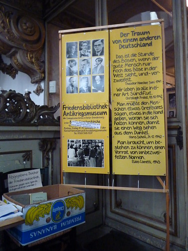
I saw the next one in the Marienkirche in Rostock, East Germany. It may be a typed font that has done this, rather than a hand and pen, but seeing as I’m not sure which, I think it is quite terrific.

The Dream of Another Germany. If you look at the word Greifbares about half way down, those two e’s are surely not identical. There are one or two other examples if you look carefully. But whoever did this is a brilliant letterer, if it was done by hand. And if it’s a font, then it is surely die Zukunft (the future).
Of course not all hand-lettering is quite so classy.

This photo was taken in a poor district of Sheffield town centre.
But the odd thing is, that where you see this jumble of letter shapes, it is quite often aimed at those who almost certainly have low to very low reading skills. Where does that leave the readability theories? I suppose it depends on which theory. My view, which is that people get used to reading all manner of type, it sits very well with. And if this potato(e) stall were to display its wares in, say Arial, I suspect that might be less appealing to those who buy from it, though I’m guessing, since I didn’t see anyone buy at all, during the time that I stood there and watched.


0 comments:
Post a Comment