Arial and Comic Sans are White Elitist, June 2011
Much is questioned and written about ‘What is the easiest font to read’, and some people express quite determined views about it. But are those with strong views being culturally non-inclusive? It does seem so.
In the easiest-font-to-read debate, there is the assumption that what is being read is in western script. What about those who read a different script, Arabic for example, or Hindi or Urdu? Are they literarily disadvantaged, because they cannot use Comic Sans? Maybe they are.

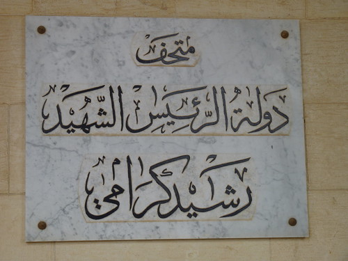
I’ve no idea what this means as I don’t read Arabic, but whatever it means, I think it is beautiful just as a design. Beiteddine Palace, Lebanon.
Possibly a plaque such as that shown in the picture would be read only with great difficulty by an Arabic-speaker with a reading disability, as it is not in Comic Sans. Unfortunately I do not have access to the wherewithal to test this hypothesis.
Though even if it were a great struggle for some, it should never be altered as it is so beautiful. Stuff the folk with reading difficulties. I can’t read it either.

Once I Was Happy But Now I’m Forlorn. But it’s in Arabic, so reads from right to left. Though the telephone number is in English, so reads from left to right. An ad for hair transplants, where the images follow the Arabic convention, or at least we hope they do. Taken from a moving bus in a polluted street, next to a power station north of Beirut.
The ad for the Berlusconi Barnet is a bit intriguing as the Arabic text goes from right to left and the English text from left to right. The images follow the Arabic. Presumably people read this OK. Admittedly, anyone who can afford a Berlusconi is likely to have a few pounds available and so might be expected to be a proficient reader, though you can never be sure, there will be some rich dyslexics I’ve no doubt.
Also there’s this article. It would appear that certain young people can find they are effectively dyslexic in one language but not in another, even when both languages use the same script.
Next page in this set: The Typeface of Danish Railways
.


0 comments:
Post a Comment