
Typefaces of the Danish Railway Company (DSB)
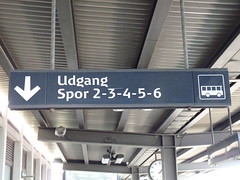
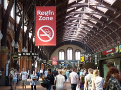
Danish railways use a stylish typeface for their station signs and passenger info. In particular it has a very distinctive lower-case g.

This might freak those people who would argue that in order to be read easily, g should look like that which comes with the Arial font; see what I have to say about this on my Typefaces for People with Reading Difficulties page.
It’s especially significant because the Danish Railways font was designed for, what else but . . . legibility – see the typophile discussion on this font.
I am pretty sure that if a British railway company were to introduce such a typeface for its public information signs, there would be a raft of experts insisting that it was not compliant with the Disability Discrimination Act. But so far as I know there are no complaints from people in Denmark. The people of Denmark have a reputation for being rather sensible.
As I allude to persistently on these pages, the individual features of the typeface are of minor significance in readability, if they even have any significance at all. The only people who might have problems with it are the self-appointed experts. Oh, that the experts be poked in the ear with an overcooked cabbage.
The Danish railway signs are very stylish and distinctive aren’t they?
More pics on my Railway Typography page on Flickr.
Next page in this set: Typefaces (Fonts) on the Web
.


2 comments:
Alot more nice view here of the typefont
http://www.kontrapunkt.com/work/dsb
Actually DSB used somewahahat the same font as BR (the helvetica-looking font) from the early 70's until the late 90's. Also, everything at the stations was colored in either black, white or red. Personally, I think that they should go back to that font and design.
Post a Comment